ShopDreamUp AI ArtDreamUp

Deviation Actions


Suggested Deviants
![[Commission] Butterflies](https://images-wixmp-ed30a86b8c4ca887773594c2.wixmp.com/f/1d6e6c4e-5e68-4b32-ac49-68a370fc92b3/d7vdsn6-b5d4914b-72ea-4b5e-9e1b-8d0b88ad73ca.jpg/v1/crop/w_92,h_92,x_0,y_6,scl_0.092,q_70,strp/_commission__butterflies_by_o_aiumi_chan_o_d7vdsn6-92s.jpg?token=eyJ0eXAiOiJKV1QiLCJhbGciOiJIUzI1NiJ9.eyJzdWIiOiJ1cm46YXBwOjdlMGQxODg5ODIyNjQzNzNhNWYwZDQxNWVhMGQyNmUwIiwiaXNzIjoidXJuOmFwcDo3ZTBkMTg4OTgyMjY0MzczYTVmMGQ0MTVlYTBkMjZlMCIsIm9iaiI6W1t7ImhlaWdodCI6Ijw9MTI4MiIsInBhdGgiOiJcL2ZcLzFkNmU2YzRlLTVlNjgtNGIzMi1hYzQ5LTY4YTM3MGZjOTJiM1wvZDd2ZHNuNi1iNWQ0OTE0Yi03MmVhLTRiNWUtOWUxYi04ZDBiODhhZDczY2EuanBnIiwid2lkdGgiOiI8PTEwMDAifV1dLCJhdWQiOlsidXJuOnNlcnZpY2U6aW1hZ2Uub3BlcmF0aW9ucyJdfQ.VZxBBhvxkEcIZU2V3j4gWZde1uQWebb4qDMYGy_dXgU)


Suggested Collections


You Might Like…


Featured in Groups


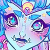
Description
i have wanted to do this for a very long time.
This is for my Sensei ~bloodstained-sheira
This is the golden haired angel, Anne >3<
first time i have drew wings in my life. OTL
I know i drew the yellow parts on her top on the wrong side.... but its cus i drew the sketch the other way and forgot to change it... ;3; OTL but i still hope you will accept this gift *U*
Anne©~bloodstained-sheira
Art© *chaotic-anime-power
Image size
2000x2731px 2.77 MB
© 2009 - 2024 Chao-Illustrations
Comments96
Join the community to add your comment. Already a deviant? Log In
This deviation really made me gawk. When I first saw this, I thought it was a collab since the lineart is executed beautifully.
The whole composition of the lineart is perfect and complements the character. The hair's shading and lighting is amazing and looks very soft. It is obvious white a lot of work was put into the coloring as the color choice is lovely.
Some things to improve on would be that the shading of the clothes could be more defined, as in more darker areas and highlights for a higher contrast and impact. And instead of using solely colors that are a shade darker/lighter than the base to shade/highlight, other colors could be used. Such as a deeper brown/gray shadow on the dark areas of the shirt. I would also recommend darker shadows in some areas on the skin (such as a brownish red and then a gray tone for deepening the shadow and creating more impact.
For the background I would recommend not a sky bg but maybe a striped or patterned stock image to match the cuteness of the girl. The sky blue against the reddish brown sort of makes the girl seem unnatural. The background doesn't fit very well.
Overall, the technique used for the lineart was wonderful, the coloring was very soft but the background could be changed for higher impact.